Visvana Today Magazine
Project Completion Time : 2 weeks | Completion Date: 30 May 2015
 Full PDF of the Magazine

Concept
I love games and as such role playing games such as dungeons and dragons have always been a large part of my life. in July of 2013 I finally took up the mantle of 'dungeon master' for the first time. I was a veteran player at the time and had a lot of ideas about how I wanted to run a game. The campaign was weekly and ran for two years. And I put my all into it. I made puzzles, I made props, I even did the little voices.
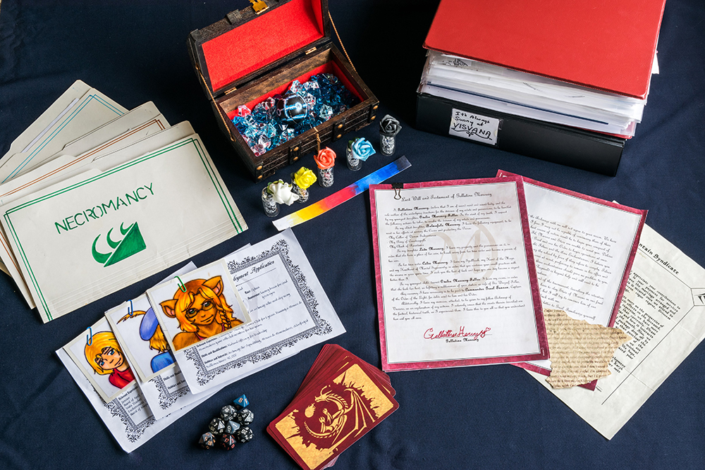
some of the props I made for the game. (better image coming!)
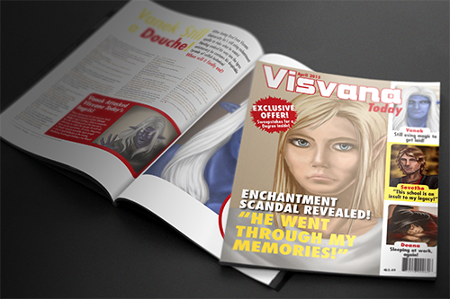
Out of that campaign a few nice little pieces actually emerged, one of them is this magazine (which I'll come back to in a moment) another would be the Visvana Arcana novel, as well as the Demon Wars children's book. But back to the magazine for a minute. So to properly explain this project you need a little context. The premise for the campaign was kooky and fun, my players were teachers in a giant floating wizard university, their first hook was they were all competing for the last slot of tenure. As the story progressed some other things happened but one of the reacurring themes was that this school was a joke, the other teachers were corrupt, the management was terrible and the students were idiots. As a result of this, the school paper was a campy tabloid. One of the players actually saw the media as a way to increase his sphere of influence and asked me if he could write for the tabloid, so each week I sent him a couple stories to write and I inputted his text into the cute little tabloid template and emailed it out to the other players as a kind of extremely biased session review.
So when we were told in class that we were doing a magazine project, I knew exactly what I wanted to do.
Method
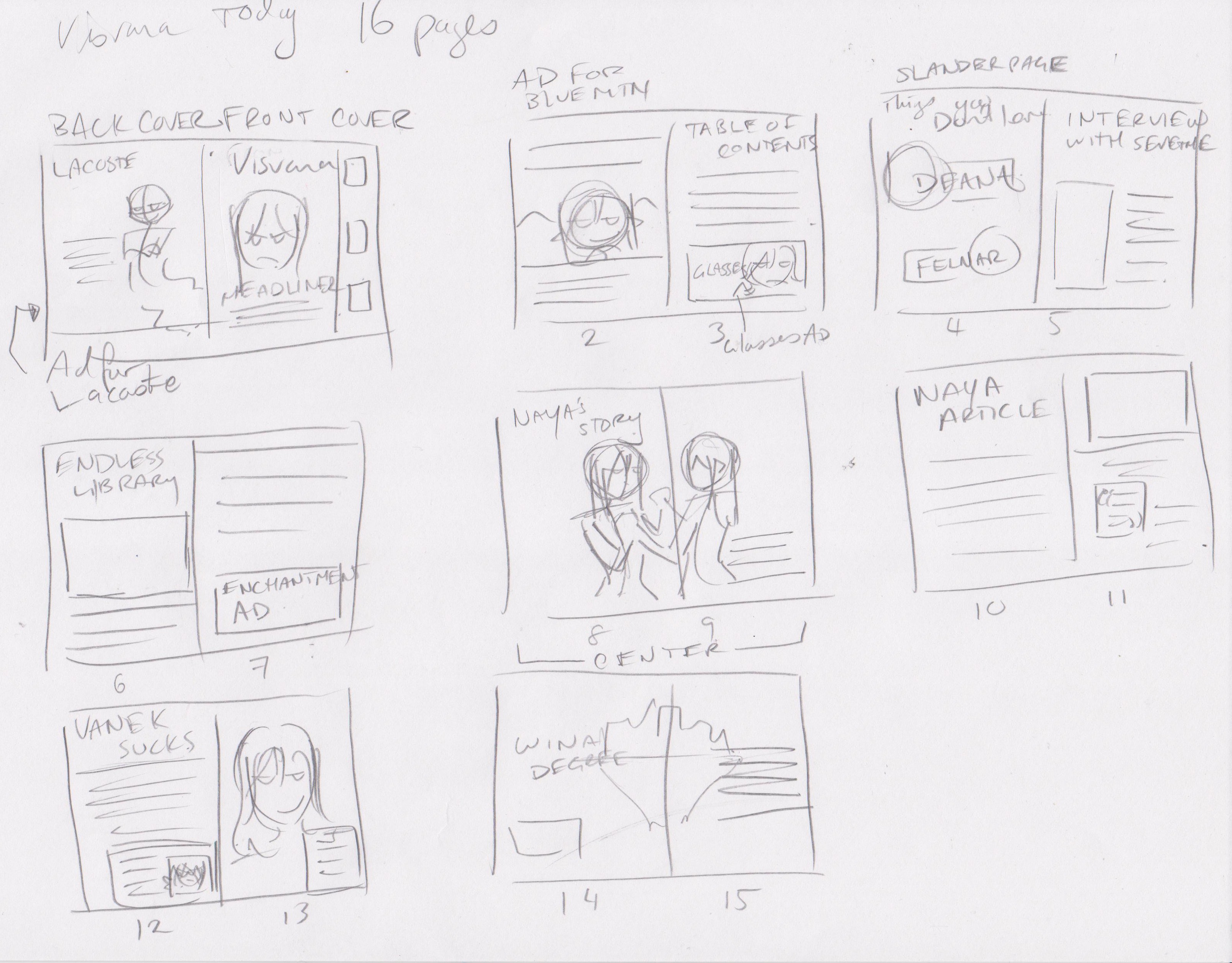
Of course one doesn't simply "create" a magazine. First stage was figuring out how many pages it was. It needed to be a multiple of four, 16 pages seemed reasonable. So the first stage was putting together an outline on paper.
The next step was writing the articles, I figured pictures would be the hardest thing, since I was planning on hand-drawing everything myself. Dialogue in writing has always been my strongest point, and I wasn't terribly keen on actually reading a tabloid to get a feel for the writing style, so my three major articles were interviews. I put them together but when I put them into the magazine I actually found that often they were too long! Large pieces had to be cut even after I chose a very small font! Then after putting in the text I had a rough idea of how large my images could be, so I began sketching and drawing all the images I would need for the project.

the ad I used for inspiration
my messy little sketch
in the final I made a few minor changes
Reflection
I enjoyed the project, it was a lot of fun, though I'm not terribly happy with it as a whole. For one, I feel like while the campy tabloid was a novel idea, as a portfolio piece it kind of fails because inherently a tabloid is not beautiful design, ergo this piece is kind of ugly in a way. I also think the tone of my center-page 'interview' was a little heavy in relation to the tone of the rest of the magazine. I feel like the pithy and thought-provoking exploration of privacy violation, eviction of free will and rape are better discussed elsewhere. In conclusion though, it was a fun project, and though there were a few things I wish I had done differently, I learned a lot and found it a worthwhile endeavor.
Other Images Included in the Magazine
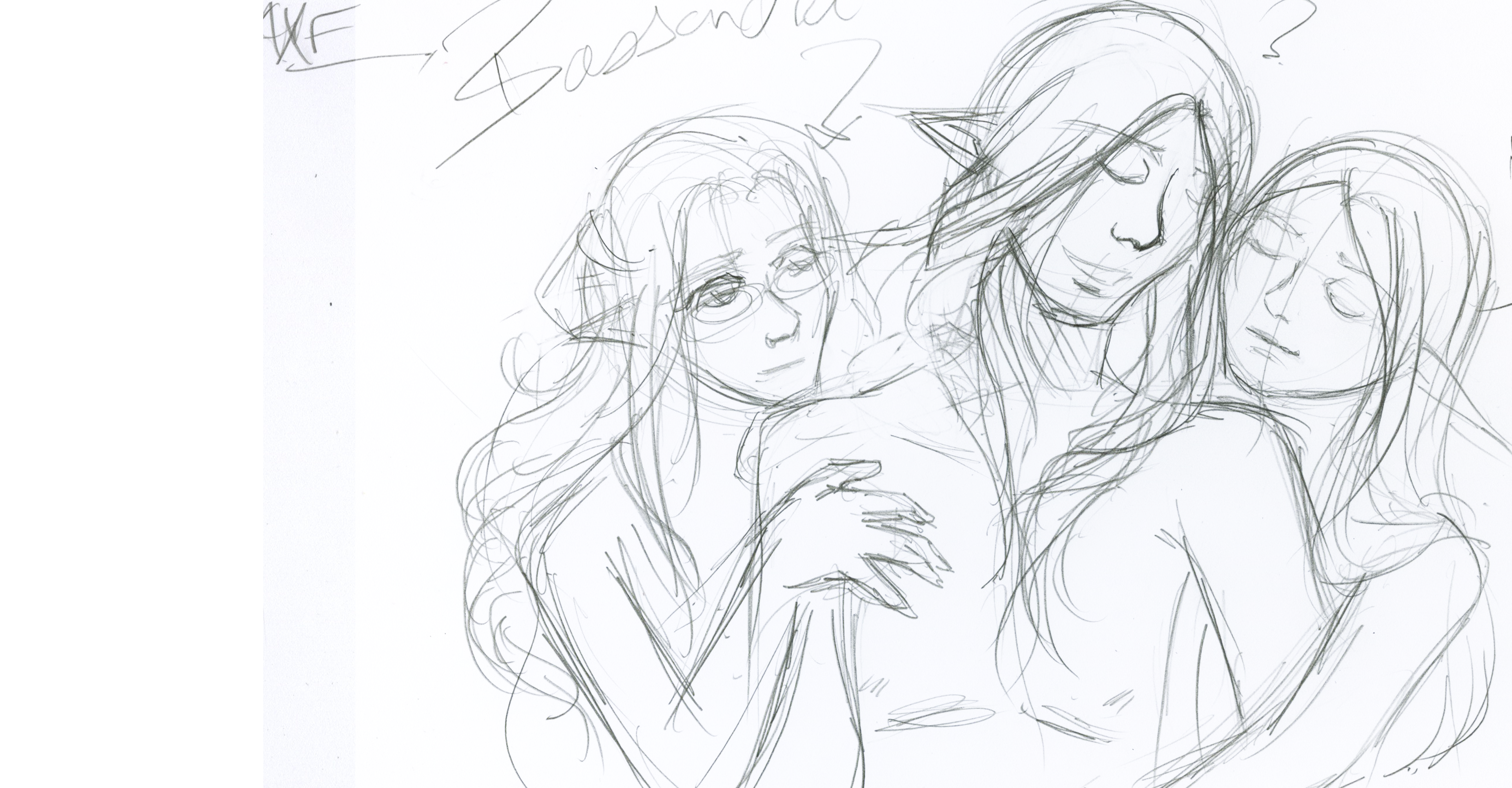
vanek & Naya silhouette
So, the spread associated with this image, was actually kind of difficult. The article I wrote needed to be gutted & pared down three times before it fit and gave me enough space for an image!
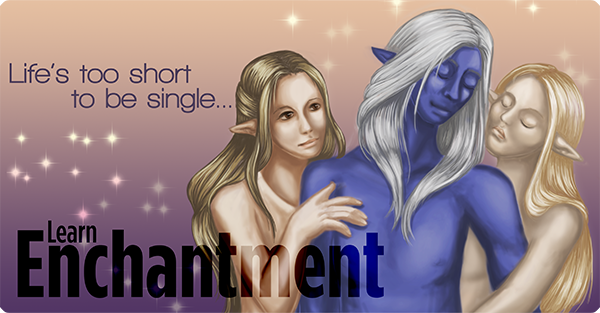
Enchantment Ad
I knew from the beginning that one of my ads was going to be a parody of an "axe" ad. And that's what this is. I discarded the color scheme of the original, but emulated the concept of the main image.
Sevethe the Businessman
I wanted to give painting a "stern businessman". I wanted high contrast and sharp cheekbones. I think it came out okay.
Venerated Archmage
ACtually, I didn't do this one specifically for this project, I just had it lying around. I wanted to try something realistic, gave him fluffier hair than usual. This piece went through a lot of iterations before looking even semi-presentable.
Enchanted Eyewear Ad
So, I ride the bus to and from... everywhere, and one the bus there's a very catching ad for glasses. I see it all the time, I decided one day that I wanted to make an ad similar to it. and voila.
Ad for Lacoste
I recall learning that the back cover ad was the most expensive because it was the best ad space, so I decided to maximum comedic effect, the rival school would get the back cover ad space.
Vanek Casting
I wanted some really awful looking candid shots of people in here, as is the style of tabloids. the expressions on some of these were really fun.
Visvana, Floating School
I'd wanted to paint the floating university for a while. I finally did it. I wanted to play with a nice soft pinkish color pallete.
Sleeping Dean
sleeping dean. not really sure what to say here. not a huge fan of how this came out, but hey, deadlines are deadlines.
Spectral Librarian, Leth
I love the concept and aesthetic of old libaries and wish I used them as a backdrop more in my work, but... I just hate painting tiny books. it's so tedious and boring!
Sevethe Visvana
this was something else I did before the project (though at the time we had been told we were doing this project) I wanted to do a face study but in a really... painty style? I guess. I'm fond of how everything but the hair came out.