
Concept
This project was a little different than most others. I had run into the creators of Cult Following at a few recent conventions and we kind of hit it off. Their game was cool and they were lovely people to boot. A few mutual favors later, they approached me asking if I wanted to work on the design for their new game "’Tis Mutiny"; an interesting hybrid competitive/cooperative game where you play as a crew member on a pirate ship, raiding ships and occasionally engaging in mutinies against your captain!
Method
Before officially signing on, they wanted an example of work, just to make sure the aesthetic was going to jive with their game. I decided to submit a goofy-looking parrot pirate.
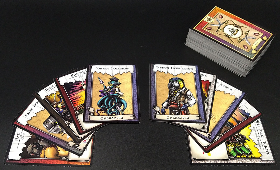
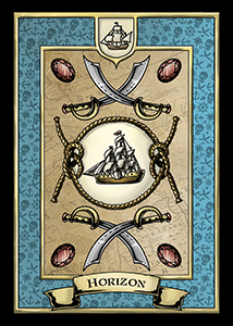
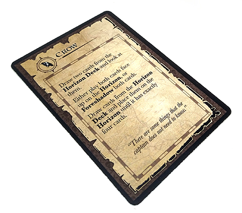
Luckily, they seemed to have a similarly whimsical sense of humor, and I got the green light to move forward. The original description called for a bunch of different types of images; from weapons, to pirates, to their ships. However, before any of that happened I needed to know what kind of canvas I'd be working with, which meant I'd need to work on the card frames before anything else. Out of the gate they knew they'd need two different card front styles, one that had a small amount of room for text and one with a large amount of room for text.
 Smaller text box
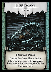 Larger text box
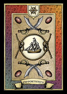
However, while I was working on the art, the team at Bravely Told Games was furiously working on card text and mechanics, and it became apparent that they needed even more room than I had initially offered. I pushed back on making the text any smaller, since I felt like it would become hard to read, so I instead made a template that allowed for even more text!
Later on we realized we needed some borders that were effectively textless, so I made this cute little border as well!
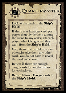
A little further on they were speaking to me about the "role" cards, which effectively defined what a player could do in the game. They wanted these to have artwork on one side and text on the entirety of the other side. The main motivation for this was the fact that one card in particular, the Quartermaster, had a lot of text on it, and the fact that these cards wouldn't require any sort of randomization, so backs with art weren't an issue.
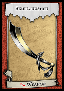
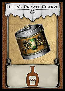
Now that all the card frames were done, it was time to actually do some artwork. The guys at BTG didn't want me to work on anything that might get scrapped later, so they got me started on weapons and rum; these were core mechanics of the game and weren't going anywhere. Initially they asked for three different weapons and three different rums. I knew there were three main “factions” in the game and decided to theme the factions with colors and animals. I then decided to make the weapons and rum match the factions. Unfortunately I absent-mindedly made two kraken-themed weapons!
 Kraken Faction
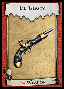 Eagle Faction
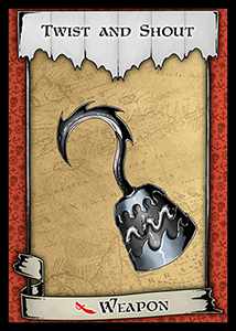 Kraken Faction
Later on I made an additional three weapons to give a total of 6 different weapon designs, with two attributed to each faction to add diversity to the deck.
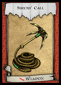 Lion Faction
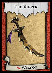 Eagle Faction
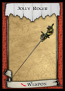 Lion Faction
Something else that was in flux was whether the weapons were going to have the half sized text box or the full size. Partially because of this, the weapons were designed with no background, so that they could accommodate either size. Eventually as you can see above, the smaller text box was settled on.
The next thing that wasn't going to change was the treasure, another core mechanic of the game. A few of the initial designs were made with the smaller frame in mind. However, not only did these not fit in the final frames nicely, but they were also just kind of mediocre, so I ended up re-doing all of them, giving them each a distinct feel.
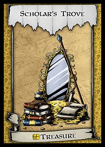 Wizard Treasure
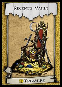 King Treasure
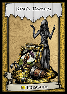 Noble Treasure
In addition to the artwork and frames, you may also notice the icons that are present on the treasure and rum cards. Icons that could replace words were another thing BTG wanted, and I was happy to oblige. However there were a few times that my experience as an avid board gamer and Magic judge caused me to pause and let them know that their desire for icons might be a little too great!
..icons
Another challenge was the loot icon. While we needed to keep it yellow in order for it to be congruent with the current card frames, the shade of yellow was really hard to see in the current text boxes. I decided to remedy this; I'd add a subtle drop shadow to the loot icon.
 Weapon icon
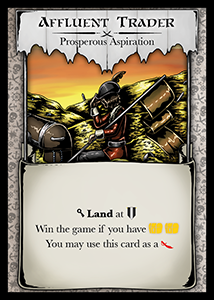 Treasure icon
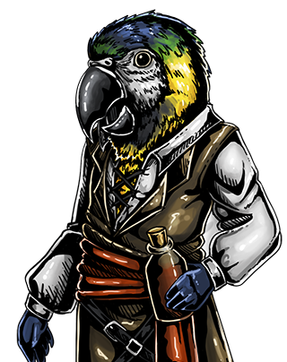
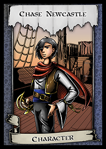
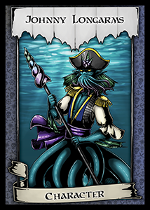
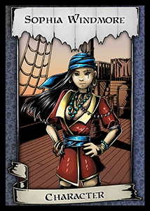
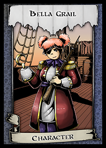
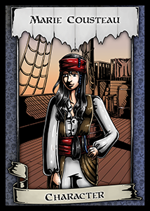
The next thing that wasn't going anywhere were the characters. They knew they'd need character portraits, so I did those second. BTG had only three requests: 1) I needed to include local "pirate" Frank Nay, 2) they wanted an Octopirate, and 3) they wanted to make sure the characters were diverse in ethnicity and body type. The Octopirate was the easiest to tackle, because of my fantasy background.
The next, Frank Nay, was a little harder, My initial design didn't look old enough, so I added some more wrinkles.
Next were all the rest of them. I don't have a ton of experience in ensemble casts, but there's no better time than the present to get that experience!
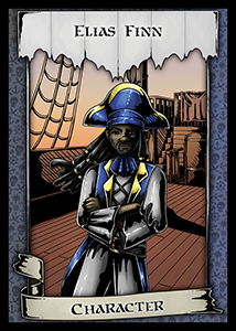
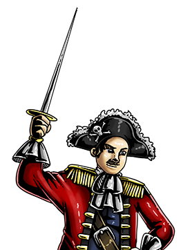
Because I effectively had carte blanche other than "don't make them all look the same", I decided to pay homage to some pirates in pop culture. The first was the infamous Jack Sparrow from the Pirates of the Caribbean movies.
The next was a homage to the popular One Piece character, Monkey D. Luffy. However the team was worried that he landed too close to the source material, so I ended up having to change his color scheme and look in the final version.
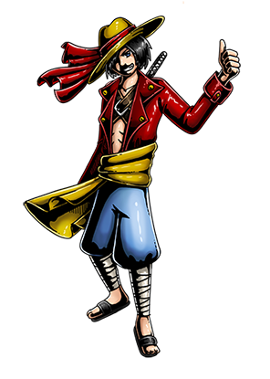 Original Design
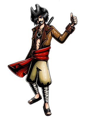 Final Design
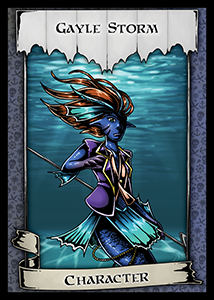
However, even though I had already fulfilled the required number of characters my mischief wasn't done yet. As you may (or may not) know I have a certain penchant for monstrous characters, and I decided to give the team a merfolk pirate. If they didn't take him, it was no big deal, but if they did I counted it as a personal victory!
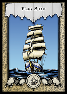
The next step was to create the ships. I’m not really good at ships so I relied heavily on reference images, however a constant problem was that I kept facing the flags the wrong way; trailing behind the ships, not in the direction the wind was blowing (which would be from the back of the ship if the sails were featured billowing out). The ships were going to follow the theming I set up earlier with the weapons. I just want to expand that as an avid Magic player, it's really important that all cards look unique across the table so they aren't mistaken for other cards. The distinct color schemes really help with that.
 Kraken Ship
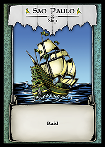 Lion Ship
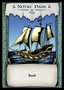 Eagle Ship
I also carried this theming through to the associated ports, and I made sure to try to keep the sky within palette as well.
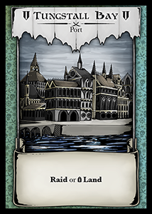 Kraken Port
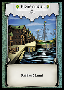 Lion Port
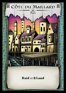 Eagle Port
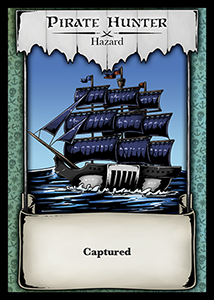
The last ship I needed to do was the dreaded “pirate hunter” ship. This one would kill the players if they ran into it, so I knew I needed to make it foreboding. It was described to me as the "sea police". To help this one be visually distinct from the others, I made the sails a dark royal blue, and I also included the characteristic white and black color scheme of law enforcement.
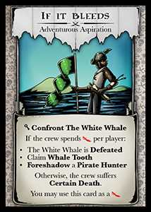
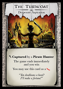
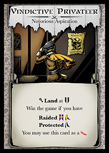
The next pieces of art were the aspirations; these were left until near the end due to the fact that these decks were constantly in design flux. The idea behind these is that they were kind of the “goal” cards of the game, and therefore the person on them should represent the player. I tried not to give them any characteristics that were too distinct, making sure to hide their faces. The four types were "notorious", "prosperous", "adventurous", and "desperate". My initial artwork for "desperate" and "adventurous" were on the mark, but the "prosperous" and "notorious" needed some work. I also tried to include a flag motif in each to mark that it was a “goal”.
My initial design for the "notorious" aspiration was that of a wanted pirate slinking in the alleyways, however the crew at BTG had different ideas. They were thinking of a pirate that knew they were wanted, but sort of flaunted their notoriety.
 initial design
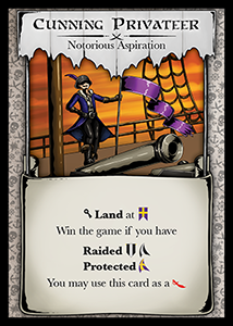 final design
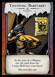
However, they liked the artwork and ended up using it on a different card.
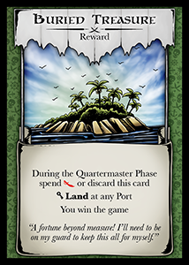
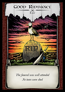
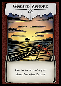
The next interesting thing was the fate deck. The idea was that these would be given to players after they had lost; since this was a very story driven game, the creators wanted a feeling of a story coming to an end even if you didn’t win. One of the options I presented to the team was a body bag floating out to sea, but they found this too gruesome.

Eventually we settled on the tombstone harried by seagulls and the ship sailing out to sea.
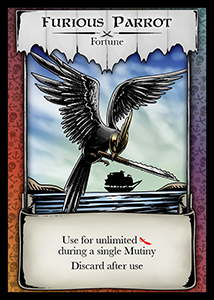
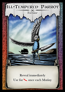
One of the cards they wanted me to do artwork for was a bird; a parrot. I decided to give them three options; my favorite was the budgie holding a steak knife, but I was worried they might find this one too goofy, so I also made the more serious cockatoo. However, once again, they liked all of them and found some fun ways to incorporate them into the game.
Finally I needed to do card backs. They wanted something that would be consistent for all the decks, but also allow for easy sorting at the end of the game. Thus I elected to have a large colored portion that corresponded to the color-coding already in place on the card fronts. To make each back even more unique I included a little icon at the top that corresponded to the "suit" as well as the deck name on the bottom.
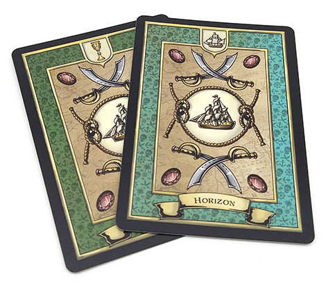
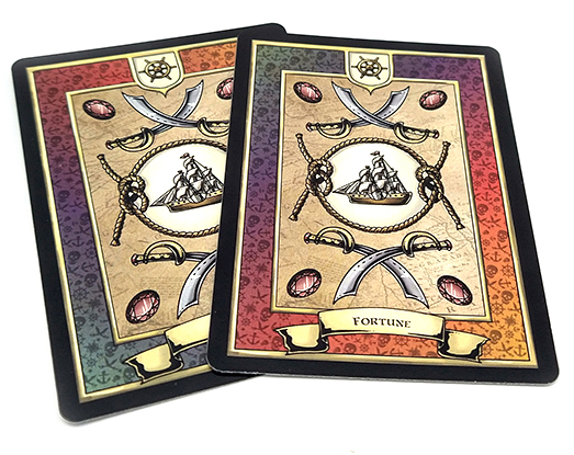
Whew! After all that work it was finally time for the first print run of the decks. Upon print we noticed a bunch of issues that weren't apparent when simply looking at the files. First, the green reward cards and the teal horizon cards came out very similar, making them hard to sort quickly. This was also a problem with the fame and fortune decks, which both had a multicolored gradient, but one was reversed, though we did suspect this might be an issue when we sent it off. Also the text on the card backs is a little smaller than I'd like it to be.
The next little issue was that the text area on the role cards was a little dark for my liking, making the contrast between the text and background too low. The remedy for this was to lighten up the background and add a white glow effect to the text.
Reflection
While this project is still ongoing, the bulk of the work is done. I really enjoyed working with Bravely Told Games, and while I greatly enjoyed solving the myriad of logistical challenges set before me, I also liked how much input they allowed me to have in some of the syntax and mechanics of the game. I'm excited for when this game finally goes to Kickstarter!