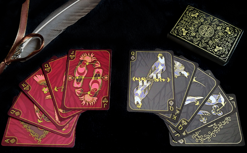
 Hearts
| Spades
| Diamonds
| Clubs
Purchase on Etsy
Concept
I’ve always liked birds. Unfortunately, random drawings of birds don't sell great at anime conventions, so I couldn’t really spend a lot of time drawing birds. However having recently moved to the middle of nowhere and doing a few small local markets, I realized that I needed a product that was more “normal”. A lot of my stuff is just so weird and niche that when I'm not engaging in anime or gaming spaces, my stuff is just a little too "out there". My Apocalypse Cards were the closest thing to a “normie product” and those are still quite weird. So, I figured this would be a good "normal" project. Everyone likes birds, right?
Method
The first thing I wanted to start with was the suits. I thought about the forms of the hearts, clubs, spades, and diamonds. I knew right away I wanted to keep the four suits but wanted to re-do the symbols to match the theme. I also knew that I wanted a delicate design with a lot of details. After turning it over in my head a few times I decided that the hearts would be two birds facing each other, and that the spade would be a diving bird. The diamond and club were more challenging, but I eventually thought of a peacock tail as being vaguely diamond shaped, and having a mother and either eggs or baby birds be the clubs. So I sat down and made some initial designs.
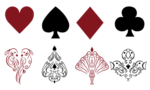 First draft of suit designs
I kept these symbols for a while, but while I was working with the design of the cards I realized that if I made the icons gold like I wanted to, I wouldn't also be able to represent the suit color on the symbol as well. In addition to this, because of all the empty space in the design, these suit symbols tended to blend in with whatever background I was using for the cards, making them hard to read. The thing I knew I did like was the concept behind each symbol, so with all these tweaks I sat down and redesigned the suit symbols. There was a lot of dithering on my part as to how to fill the symbols, but eventually I decided on the two-toned look, because I could carry that concept into the face cards later.
 Final suit symbols
The next thing I needed to do was to figure out an aesthetic. This wasn’t too hard, I knew I wanted the cards to be elegant. Initially I wanted a white and gold design, but after fiddling with it I realized it wasn’t going to work and settled on a darker palette instead. One of the big issues with my previous deck, the Apocalypse Cards, is how subtle the suit colors are, which makes some games very hard to play. This is compounded by the fact that I didn't go with the traditional red and black color scheme for the deck either. For the bird cards I wanted to stay much closer to the traditional playing card designs for functionality purposes. I wanted the red and black suits to be very distinguishable and I wanted the suit symbols to remain traditional.
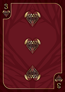 A red avian card
 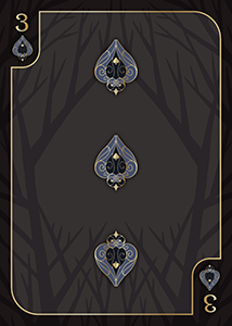 A black avian card
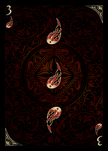 A red apocalypse card
After picking the color I needed to figure out how to “texture” the cards. The apocalypse cards had a faded copy of the card back in the background:
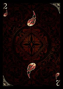 A red apocalypse card
I didn’t want to do that again, so I thought for a bit and decided that I’d have something that vaguely looked like a tree, but twisted into the suit icon, to help with suit recognition in a very subtle way.
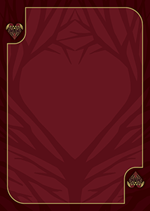 Hearts
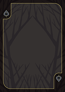 Spades
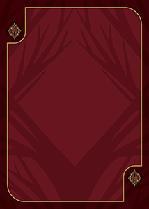 Diamonds
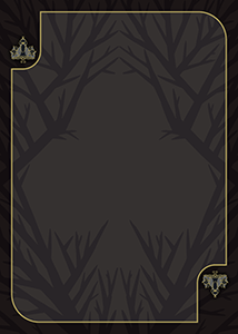 Clubs
Clubs
The next thing I needed to think about was how to do the seven. I wanted the cards to be conventional, but the traditional seven (first one in the image below) is extremely ugly due to the asymmetry. I ended up talking to my partner and he suggested a symmetric seven design that I thought looked really good. Before going with it though I decided to ask my friends online what they thought of the different seven options.
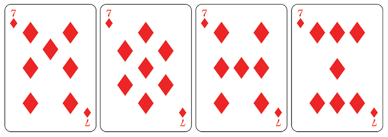 Different styles of sevens
Overwhelmingly, people liked the second option best. Personally I also liked it; the symmetry made it really appealing. While I knew it might cause some confusion with the 8, I felt like for a deck of playing cards that leans more on aesthetics than functionality, this was an okay tradeoff.
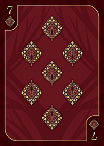 Final seven
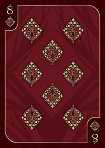 Final eight
The next challenge to tackle would be the face cards. I knew they were going to have birds on them, but which birds would I choose? To keep them all from looking “samey” each bird needed to look unique. Unfortunately, a lot of birds are identified by their coloration, but that wasn't something I could include if I wanted the designs to be congruent with the current aesthetic. Some birds are also identifiable because of the patterns in their feathers, but again this also wasn't something I could easily incorporate into my design. That meant that the kinds of birds I needed to feature were those with strong silhouettes. This did severely limit the amount of birds I had to choose from; luckily there are a lot of birds out there. I wanted each suit to have a theme, but with all the restrictions, it didn't come through very strongly. The hearts all feature tropical birds, the spades feature predators, the clubs feature North American birds, and the diamonds feature... uh... I guess silly looking birds?
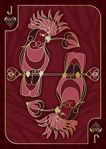 Jack of Hearts
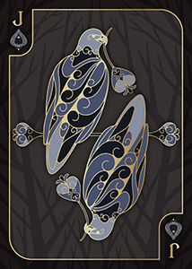 Jack of Spades
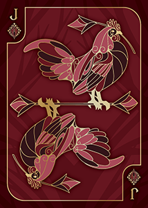 Jack of Diamonds
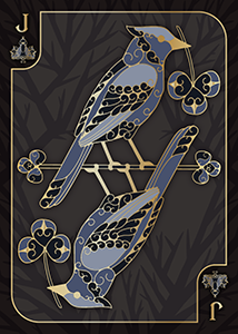 Jack of Clubs
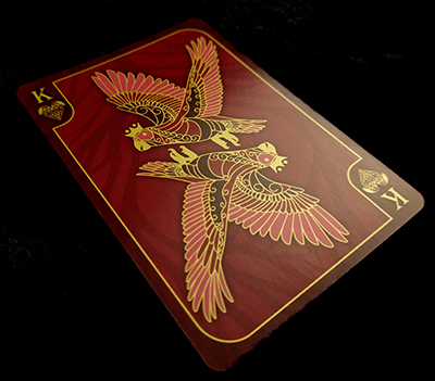
Another thing I did to help visual cohesion was I gave each face card a clear visual marker, to distinguish it from the others. Above you can see that all the jacks are holding a leaf that bears a resemblance to the suit shape. The queens all have tiaras. The kings have proper crowns and are in flight.
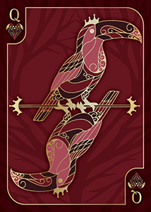 Queen of Hearts
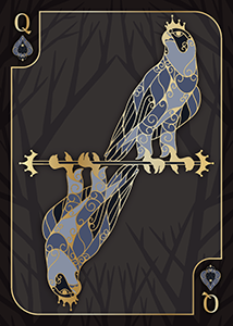 Queen of Spades
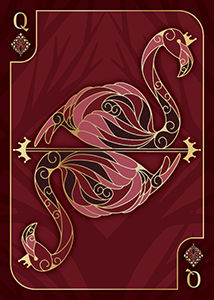 Queen of Diamonds
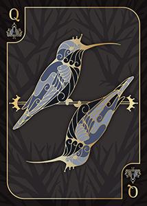 Queen of Clubs
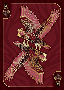 King of Hearts
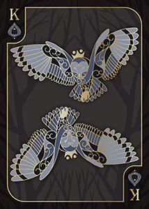 King of Spades
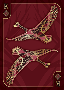 Kinf of Diamonds
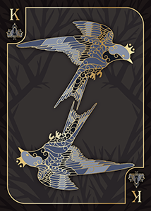 King of Clubs
The next big challenge was the aces. After a lot of deliberation I decided to feature nesting birds, with the nest turning into a suit-shaped filigree enclosing the entire image.
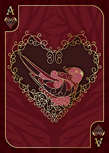 Ace of Hearts
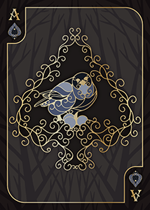 Ace of Spades
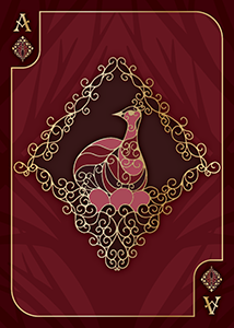 Ace of Diamonds
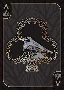 Ace of Clubs
Next were the jokers. I had been kind of thinking about them while I was working on the drawings for the other suits. I decided that while the entire aesthetic of the deck would be elegant and refined, I wanted the jokers to be kind of... goofy. Having a pet bird of my own I knew exactly how silly birds looked when they were playing with toys, so I decided that the jokers would be pet birds playing with toys. The suit symbol for the jokers was also something that gave me pause. My previous deck had used a pentacle, which was thematic for that deck but not this one. Traditional decks just spell out the word "joker" down the side, but I didn't have space for that (and it also looks bad). Then it hit me, the symbol would be a j-shaped feather! It was perfect!
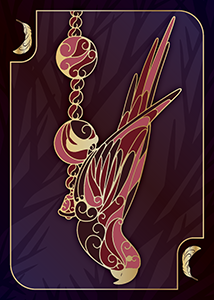
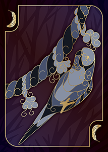
There were a few that ended up not making the final cut. The flamingo was too tall and looked awkward on the branch since she was supposed to be a queen. The cockatoo was leaning over to one side too much and left too much of the card blank, and the lovebird was too flat and left too much vertical space on the card.
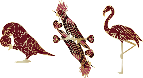 Rejected Face Cards
Finally I needed to make a card back. I always low-key dread making card backs since they're finicky and you don't really know whether they look good until you're basically done the design, so it ends up with a lot of scrapped designs. Luckily, since most card backs should be rotationally symmetric, I only have to design one quadrant. Initially I tried making abstract looking birds out of feathers. Unfortunately these ended up looking like angelic monsters straight out of Bayonetta or Evangelion. I quickly scrapped that and went for more normal looking birds made out of swirls.
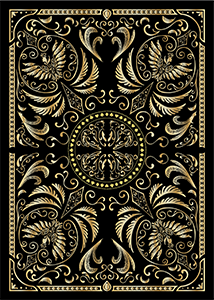 The birds are horrifying
I then went to fill it in with a vine design. Unfortunately the vines looked less like vines and more like abstract swirls, so I decided to put some leaves on them. Well.. that ended up with a very starry looking design. It was a bit overwhelming.
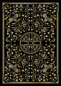 Looking at this gives me a headache
I got rid of the horrible star-shaped leaves and put in more subtle leaves. I also made the card border a delicate feather pattern instead of the dots I'd had there previously. It was definitely getting better but was still a bit busy. I took a bunch of the elements and made them a darker color to reduce the visual noise.
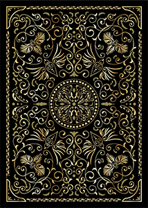 Almost there...
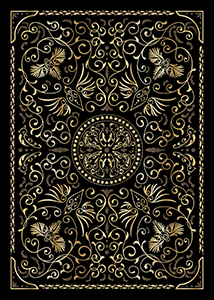 Final Cardback
Before I got them printed I had to pick a gold color for the ink. The Apocalypse Cards had a nice gold, but I wanted something brighter (but still metallic) for this set. I actually bought a pantone metallic ink guide and picked a gold from it. When the cards arrived I was a little disappointed, I think the color was just a hair too orange but I'm not overly upset about it.
When I made the box, one of the things I constantly regretted about the Apocalypse Cards was the fact that the box wasn't fancy at all! For the bird cards I went all out, getting both spot UV and gold ink on the box!
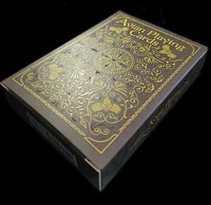 Spot UV
When I posted the progress pictures online, someone mentioned that they thought the bird designs might look good as enamel pins. I pondered the thought and looked into it. Enamel pins are kind of expensive and hard to sell online because of the high shipping costs, but as an add-on it might do okay. Also this would mean that I could make a pin of my pet! I decided to recolor the pin so it had the actual coloration of an African Grey Parrot. I love it, I think she came out really cute! I'm not sure Ada likes her as much though :0
.jpg) African Grey Pin
African Grey Pin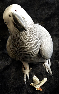 Ada with her pin
Reflection
I had a great time doing this project, I’m happy I could fuse my love for birds and my love for cards into something like this! I think I got to solve a lot of the issues with the previous playing card project, and personally I think this one looks a bit better. It is less creative and artistic than the last one, but I adore it!
Hearts
| Spades
| Diamonds
| Clubs
Purchase on Etsy